
Introduction
What is Data Visualization?
Data visualization is the process of turning complex numbers and facts into visual representations that are easy to understand. It involves using charts, tables, graphs, maps, and images to show information clearly and effectively. Each element serves a purpose: interactive charts and maps make your dashboard engaging, tables and text provide extra detail to enhance clarity and understanding, and shapes or images support highlighting key KPIs or even add branding. Simply put, data visualization helps simplify information, so it is accessible to everyone, aiding better decision-making. For instance, a pie chart can depict the distribution of a budget among departments, while a bar chart can display sales growth over a year.
Why Visualize Data?
Visualizing data is essential because it transforms raw numbers into meaningful insights that are easier to understand and act on. When dealing with large datasets, identifying key insights can be challenging. For example, understanding the loan amounts contributed by each state in a table format requires time and effort to compare individual values. However, visualizing the same data using a bar chart simplifies the process and provides immediate clarity.
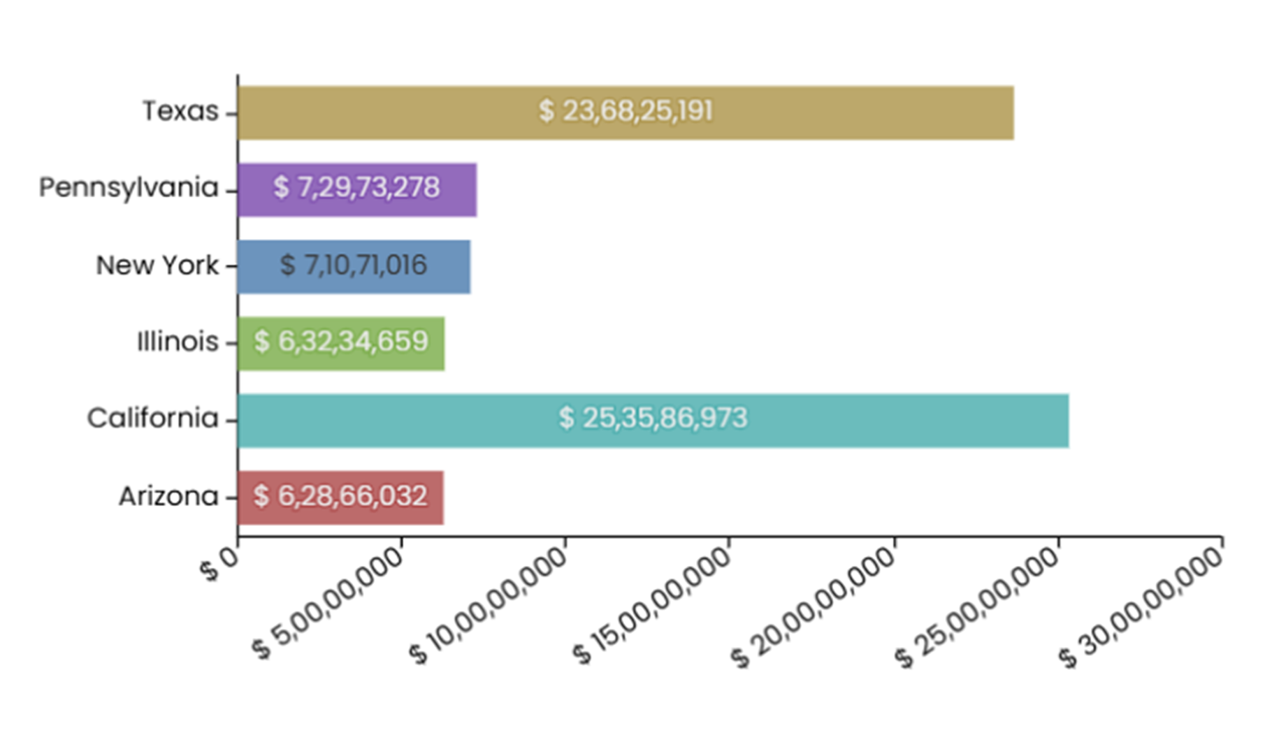
In the chart below:
- The length of the bars quickly shows which states contribute the most and least to the total loan amount.
- From the chart, it is clear that California has the largest contribution, followed closely by Texas, while Arizona has the smallest share.
- Without the chart, comparing numbers like $25,35,86,973 for California and $6,28,66,032 for Arizona would be complex and prone to errors.
The key advantages of visualizing your data are:
-
Makes Data Easy to Understand: Data visualization turns complex information into simple visuals like charts and graphs, helping people quickly understand what the data means.
-
Helps to make Faster Decisions: Visuals make it easier to interpret data, allowing individuals and teams to make informed decisions more quickly.
-
Reveals Patterns and Trends: Charts and graphs make it easier to spot patterns, trends, and connections that might not be obvious in raw data.
-
Highlights Key Information: Utilizing colors, shapes, and formatting to draw attention to important details, such as important KPIs.
-
Improves Communication: Visualizing data helps explain complex information clearly, making it easier to share insights with others, even those without technical knowledge.
-
Encourages Data Exploration: Interactive visuals let you dive deeper into the data, filter information, or explore details, making the process more engaging.
-
Supports Better Storytelling: By combining visuals with explanations, data visualization helps tell a clear and compelling story, making the data more relatable and impactful.
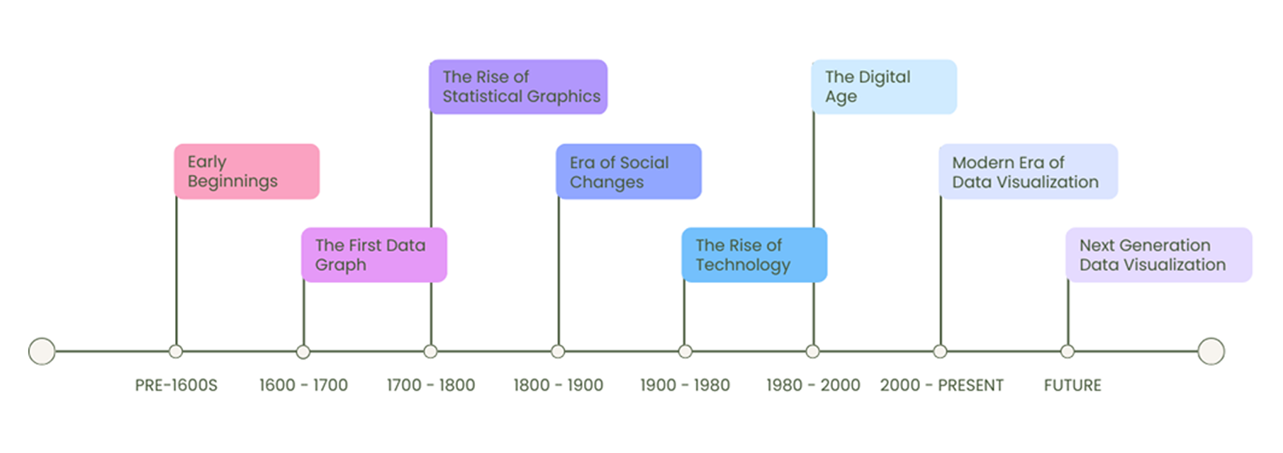
History of Data Visualization
Starting with simple maps and charts in the past to the advanced interactive dashboards, data visualization has developed over hundreds of years to make complex information easier to understand and share.
-
Early Beginnings: The idea of showing information visually began thousands of years ago. Early civilizations like the Babylonians, Chinese, Romans, and Egyptians created maps to show locations for navigation, farming, and trade. These early drawings helped people organize and understand data, laying the foundation for the visual tools we use today.
-
The First Data Graph: In the 17th century, Michael Florent Van Langren, a Flemish astronomer and engineer, made a significant contribution to data visualization. In 1644, he created the first known graph to represent data. His graph showed the variation in longitude estimates between cities, highlighting how much disagreement there was among experts at the time.
-
The Rise of Statistical Graphics: In the 18th century, charts became popular for understanding numbers. William Playfair, who is often called the father of modern data visualization, invented three chart types we still use today:
-
Bar Charts (1786): Compare quantities in different groups.
-
Line Graphs (1786): Show trends or changes over time.
-
Pie Charts (1801): Display parts of a whole.
-
-
Era of Social Changes: In the 19th century, people started using visualizations to solve social problems. Two well-known examples are:
-
Florence Nightingale: She created special charts (called coxcomb charts) to show the causes of death during the Crimean War. Her work proved that poor sanitation was killing soldiers, leading to changes in public health.
-
Charles Joseph Minard: Minard created a famous map in 1869 showing Napoleon’s Russian campaign. His chart combined numbers and geography to show troop losses during the march. It told a powerful story about failure and survival.
-
-
The Rise of Technology: The 20th century saw huge changes as technology advanced. Computers made it easier to organize and display large amounts of data. For example:
-
Early tools like IBM’s punch cards helped process data faster.
-
In 1983, Edward Tufte, an expert in visual communication, wrote a book called The Visual Display of Quantitative Information where he focused on the importance of making visuals clear, precise, and honest.
-
-
The Digital Age: By the late 20th century, the rise of the internet and computer software changed how people use data. Visualizations became interactive, allowing users to explore data in real time.
-
Tools like Excel and Tableau made it easy to create charts and graphs.
-
New types of visuals, such as heatmaps and scatter plots, were introduced and became popular for analysing different types of data.
-
-
Modern Era of Data Visualization: Today, data visualization is used in almost every field, including business, healthcare, and education. Modern tools allow people to interact with data to better understand trends and make decisions.
-
Tools like Power BI, Tableau, Infoveave help create dashboards to explore data visually.
-
Artificial Intelligence (AI) and Machine Learning (ML) now help process large amounts of data and automatically highlight patterns.
-
-
Next Generation Data Visualization: Data visualization will continue to improve as new technologies emerge:
-
Augmented Reality (AR) and Virtual Reality (VR) will help create 3D charts that are interactive visuals making data exploration easier.
-
Artificial Intelligence (AI) will provide smarter visualizations by analysing data faster and more accurately.
-
Role of Data Visualization in Business
Data visualization is essential for businesses today. It helps them understand their data and make better decisions. Here are some examples of how data visualization supports business growth:
-
Marketing and Sales: Businesses use data visualization to track customer behaviour, sales performance, and marketing success. By visualizing customer demographics and sales trends, companies can decide who to target, what messages to use, and how to spend their resources wisely.
-
Operations and Supply Chain: Data visualization helps businesses improve operations and supply chain. By analysing inventory levels, production schedules, and supplier performance, companies can find inherent bottlenecks , reduce costs, and increase efficiency.
-
Finance and Accounting: Businesses use data visualization to monitor financial performance, spot trends, and predict future results. Visualizing data like revenue and expenses helps companies plan better and manage their finances effectively.
-
Human Resources (HR): HR teams use data visualization to track employee performance, analyze hiring trends, and measure retention rates. This helps them improve recruitment strategies and manage their workforce efficiently.
-
Customer Service: In customer service, data visualization helps businesses analyze customer satisfaction, feedback, and response times. By identifying common issues, companies can improve service and provide a better customer experience.
-
Banking: Banks use data visualization to detect and reduce risks, including fraud. By tracking trends and compliance metrics, they can manage risks proactively and ensure safe, smooth transactions.
Now that we know what data visualization is, its evolution and importance, let us look at how to do it well. The next section explains the basic principles that make visuals clear, simple, and easy to understand.