
Map Widget
A map widget is an interactive visualization tool that displays geographic data on a map, enabling users to explore spatial information and identify patterns, trends, or relationships based on location. It combines data with geographic features like cities, regions, or countries to create a visual representation of information, making it easier to analyze location-based data.
-
Map Display Component: The map provides a geographic base, such as country borders, roads, or other spatial features, on which data is layered. It serves as the visual foundation for displaying geographic insights.
-
Interactive Features: Map allows to zoom, pan, click on specific areas, or use filters to focus on regions or data categories. These features enhance usability and exploration.
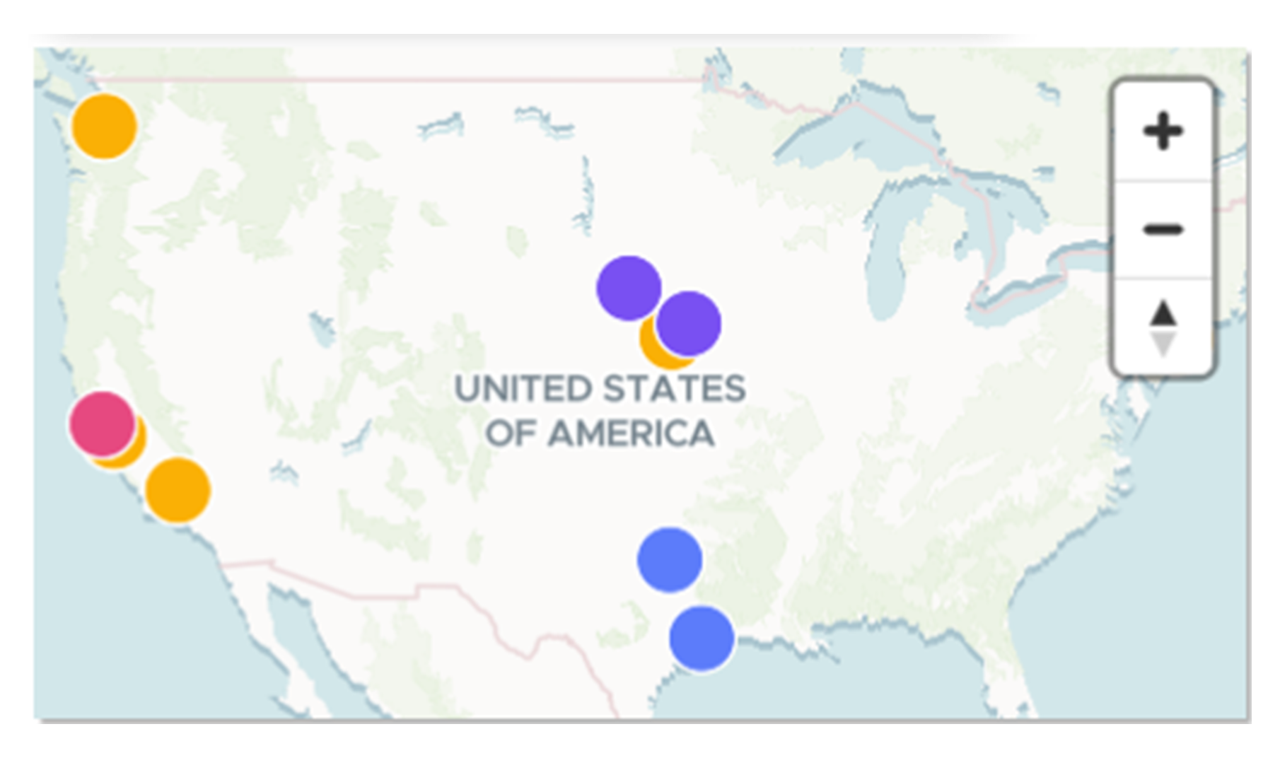
The map widget above visualizes sales performance across different regions. Each region is color-coded based on total sales, with darker shades representing higher values. This geographic visualization helps identify top-performing regions, locate underperforming areas, and analyze sales distribution patterns across locations.
When to Use a Map Widget
-
Visualizing Geographic Data: Use a map widget to display data with a spatial or geographic component.
-
Analyzing Regional Trends: A map widget is effective for understanding trends, such as sales performance, demographic distribution, or resource allocation, across specific regions.
-
Identifying Hotspots: Highlight areas of high or low concentration using color gradients, markers, or heatmaps.
Do’s:
-
Use a map widget for location-specific data to provide clear spatial insights.
-
Use color gradients, markers, or overlays to differentiate regions and data values effectively.
-
Enable interactive features like zooming and tooltips for enhanced exploration.
-
Label regions, markers, and legends clearly to ensure easy interpretation.
-
Include a legend or key to explain the colors, symbols, or scales used in the map.
Don’ts:
-
Don’t use a map widget for data that lacks a geographic component.
-
Don’t overcrowd the map with too many data points or markers, as it can reduce clarity.
-
Don’t use unclear or inconsistent color schemes, as they can confuse the user.
We have learnt about the classification of charts, their dos and don’ts, and when to use them. Next, we will explore how Infoveave can deliver powerful data visualizations.