
Infoboard Designer
The Infoboard Designer offers powerful features to create interactive and visually appealing dashboards. It highlights key insights with tools like shapes, filters, and views, making data easy to understand. Custom colors, images, and layouts give dashboards a professional and polished look. Interactive options like drilldowns and interactions help explore data in detail, while flexible layouts and views adjust to meet specific needs or add extra context.
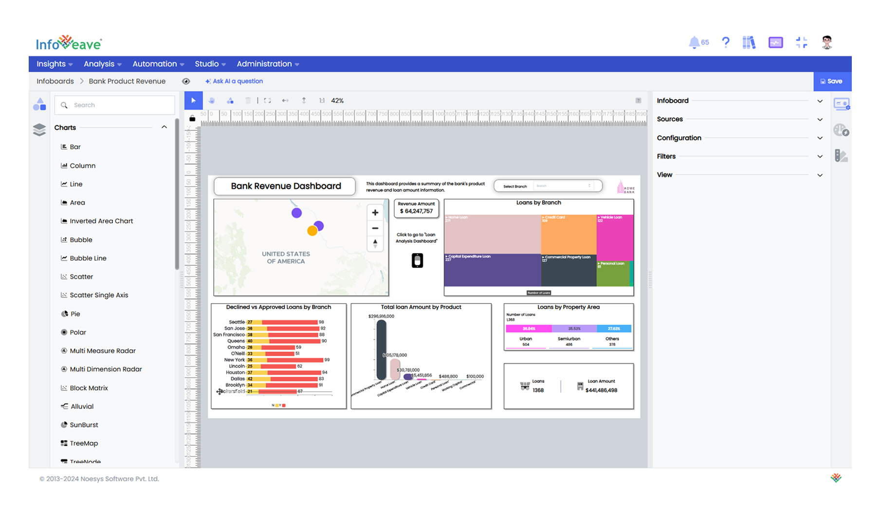
Here is a detailed look at the key aspects that make Infoboard Designer an essential tool for effective data visualization.
Clear and Organized Layouts
Infoboard Designer ensures dashboards are well-structured and easy to understand by organizing components and maintaining visual clarity.
-
Widgets and Layers: Charts, tables, and labels work seamlessly with shapes like boxes, lines, or arrows to emphasize key information. Layering keeps the layout clean and avoids clutter.
-
Grid Layout: Widgets are arranged in a structured grid, ensuring neat and consistent alignment.
-
Configuration and Customization: Configure widgets and customize the, stylings, fonts, and colors, making dashboards look professional and aligned with your branding.
Simple and Focused Visuals
Infoboard Designer helps highlight key insights by focusing on the most important metrics and trends.
-
Fixed Filters: Filters ensure widgets always display the most relevant and important information.
-
Conditional Formatting: Dashboards dynamically adjust colors or styles based on predefined rules, such as highlighting low performance in red, to make important insights stand out clearly.
Flexible Designs
The Designer gives complete control to create layouts tailored to specific needs, ensuring both functionality and creativity.
-
Designer Layout: Widgets and shapes can be freely positioned and resized, enabling unique, custom designs.
-
Images for Branding: Add logos, icons, or background images to enhance engagement and reinforce your organization’s identity.
-
Subviews: Replace traditional tooltips with small, interactive charts or widgets that display additional details filtered by selected data. For instance, hovering over a bar can show a detailed breakdown in another chart, adding context without cluttering the main dashboard.
-
Adaptable Layouts: Dashboards automatically adjust to fit desktops, mobile devices, and print formats, ensuring a seamless experience across all platforms.
Interactivity
Interactive features allow users to explore data in depth and connect different parts of the story effortlessly.
-
Filters and Controls: Filter data or view specific details easily using the dropdowns and checkboxes.
-
Drill Down and Drill Up: Clicking on summaries reveals more detailed information, enabling deeper analysis.
-
Actions: Buttons or shapes can act as links to navigate between dashboards or open detailed reports, ensuring continuity in storytelling.
Visual Engagement
Infoboard Designer prioritizes aesthetics and engagement to make dashboards both appealing and functional.
- Color Themes: Consistent color schemes improve readability and help highlight key trends or changes.
Now that we know how Infoveave contributes to impactful dashboards, let us explore its key features in detail.