
Storyboarding
Effective storytelling in data visualization starts with thoughtful storyboarding and a well-defined dashboard structure. Storyboarding is the process of planning and sketching the flow of information before building the final dashboard. It ensures the data tells a clear and logical story, while a structured dashboard design connects these using visuals, insights, and actions.
Key Elements for Effective Dashboard Storytelling
A dashboard designed for effective storytelling must combine clear purpose, focused visuals, and actionable insights. The key elements for effective dashboard storytelling are:
-
Name and Description: Every dashboard begins with a clear name and a descriptive overview. The dashboard name sets expectations, while the description explains what the dashboard is for and why it matters.
-
Logical Flow of Information: A logical flow starts with high-level metrics/KPIs and gradually moves to more detailed insights.
-
Charts and Graphs: A successful storyboard and dashboard structure depends on selecting the right visuals to communicate data clearly:
-
Bar Charts: Compare categories, such as loan disbursements across regions.
-
Line Graphs: Show trends over time, like increasing default rates.
-
Pie Charts: Display proportions, such as overdue vs. repaid loans.
-
Text Widgets: Highlight reasons for delays or cancellations to provide qualitative insights.
-
Label Widgets: Show exact figures for KPIs, like the total number of loans approved.
-
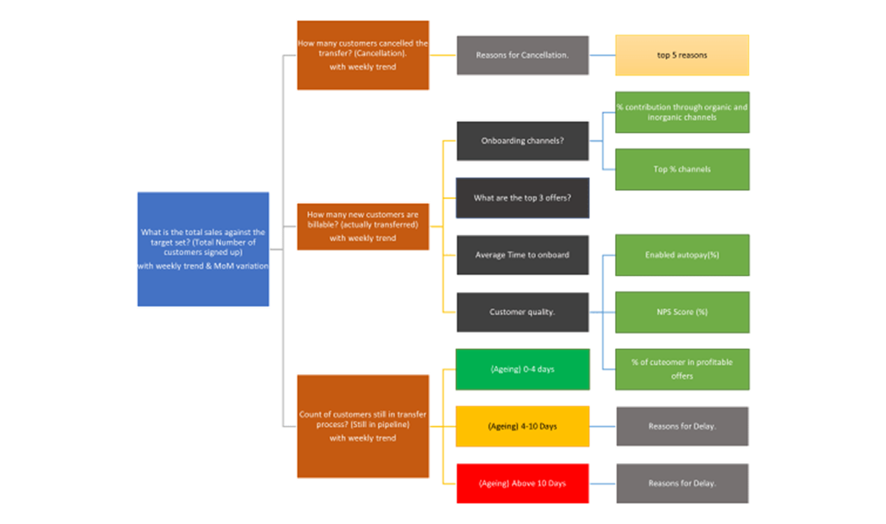
Storyboarding helps present complex information in a way that is engaging, meaningful, and easy to understand. Here are the key benefits of storyboarding:
-
Organizes Information Logically: Storyboarding structures the flow of data from high-level summaries to detailed insights. For example, a loan performance dashboard might start with total loan disbursements, followed by overdue rates by region, and then trends over time. This logical flow ensures the audience understands the big picture first before diving into specifics.
-
Focuses on Key Insights: Storyboarding helps identify and prioritize the most critical metrics and visuals. It eliminates unnecessary details, keeping the dashboard focused and uncluttered.
-
Defines a Clear Narrative: By planning how visuals connect to one another, storyboarding creates a natural progression of information. For example, a storyboard might display KPIs first, followed by charts that explain trends, and finally text widgets or insights to highlight problem areas or solutions.
-
Saves Time and Improves Collaboration: A well-planned storyboard reduces the need for rework and ensures stakeholders are aligned on the dashboard’s goals before the design begins.
Understanding the principles of effective data visualization lays the foundation for creating clear and impactful visuals. Now, let us explore how choosing the right charts can bring your data to life and ensure the story is communicated effectively.