Color Palette
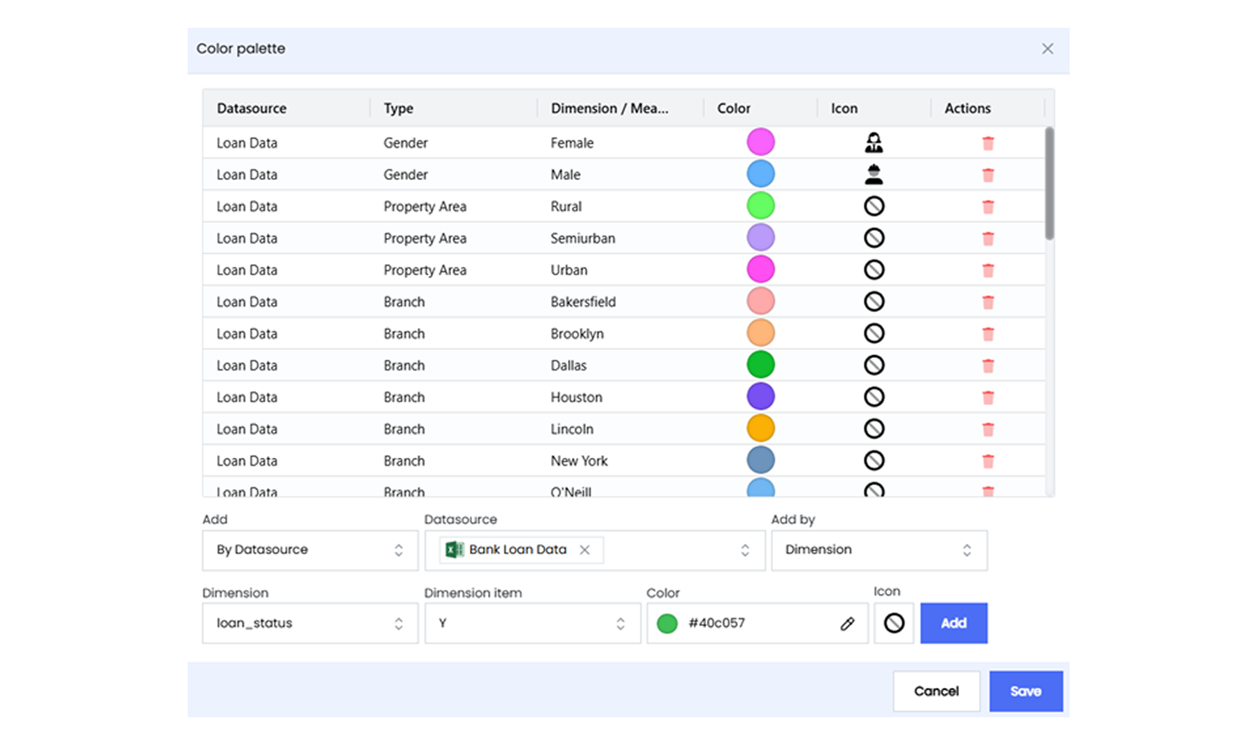
The Color Palette in Infoboard Designer allows assigning specific colors and icons to data elements like dimensions and measures. This feature only enhances the visual appeal of dashboards and also improves clarity and consistency across all visualizations, making data easier to interpret and more engaging.
Why Use Color Palettes?
-
Improved Data Understanding: Colors help distinguish between different data points, making patterns, trends, and outliers more obvious. For example, assigning specific colors to sales regions can make it easier to compare performance visually.
-
Consistency Across Dashboards: A standardized color palette ensures all dashboards within an organization use the same visual language. This consistency reduces confusion and creates a unified look and feel across reports.
-
Enhanced Branding: Aligning dashboards with organizational branding by using company colors reinforces brand identity and creates a professional impression.
Key Features of the Color Palette
-
Customizable Colors and Icons: Colors and icons can be assigned to specific dimensions and measures, ensuring clear differentiation between data categories. For example, a specific color can represent each department in an organizational report.
-
Global Application: Once defined, the color palette updates all Infoboard visualizations that use the assigned dimension or measure. This ensures uniformity across dashboards without requiring manual adjustments for each visualization.
-
Easy Setup and Editing: The color palette can be accessed and configured from the Setup tab in the Configuration panel. You can add new colors, modify existing ones, or delete unnecessary assignments with just a few clicks.