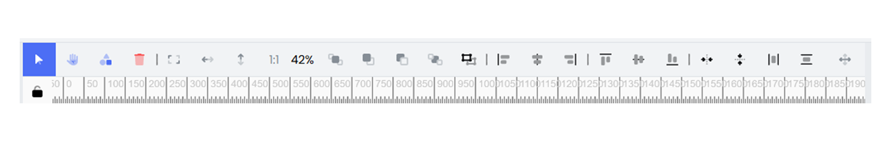
Toolbar
The Infoboard Toolbar in Infoveave is a tool that helps manage widgets, layouts, and organize dashboard components effectively. It offers a range of features that make it easy to create clean, organized, and visually appealing dashboards. The toolbar combines options for positioning, aligning, and scaling widgets while also enabling additional controls for navigation and design. The toolbar simplifies layout management, ensures clarity, and gives full control over widget placement and appearance. It allows you to:
-
Use Pan Mode to navigate the dashboard and Select Mode to move or edit widgets.
-
Draw shapes to highlight important data points or separate sections.
-
Align and distribute widgets evenly for a clean and professional look.
-
Set specific dimensions and positions for widgets to maintain consistency.
-
Fit the canvas view to height or width for better visibility while working.
-
Lock and hide widgets to streamline the design process and focus on specific elements.
Key Features of the Infoboard Toolbar
-
Pan and Select Mode: The toolbar allows to interact with the dashboard using two modes. Pan Mode allows smooth navigation across the canvas by moving to different sections easily. Select Mode, allows to select, move, and edit widgets or shapes placed on the canvas.
-
Widget Management: The toolbar makes it easy to manage widgets on the dashboard. It allows to move, resize, and arrange widgets to maintain a clean and organized layout. The delete option allows quick removal of unnecessary widgets to declutter the design. Additionally, widgets can be grouped to move as a single unit, while the ungroup option breaks them back into individual components for further customization.
-
Shapes: The toolbar provides options to draw shapes like rectangles, circles, or lines. These shapes help emphasize key information, highlight trends, or visually divide sections of the dashboard.
-
Canvas View: The toolbar includes options to adjust how the canvas appears during design. Fit to Height scales the canvas to match the height of the workspace, while Fit to Width adjusts it to cover the full width.
-
Widget Dimensions and Position: The toolbar allows to set the exact size and position of widgets for precision. Designers can specify the height and width to ensure uniformity across widgets. Additionally, setting X and Y coordinates helps position widgets accurately on the canvas, creating a polished and structured layout.
-
Alignment and Distribution: The toolbar provides alignment tools to organize multiple widgets neatly. These options are enabled when two or more widgets are selected. You can align widgets to the left, center, or right and to the top, middle, or bottom. The toolbar also offers options to distribute widgets evenly, both horizontally and vertically, ensuring a balanced layout.
-
Z-Index Management: The toolbar allows to control the stacking order of overlapping widgets using Z-index controls. It allows to move widgets forward or backward to decide which elements appear on top. This ensures that key visuals remain at the front and background elements stay un obstructive.
-
Visibility and Locking: Manage visibility and control widget movement using the Show/Hide option that allows widgets to be temporarily hidden. The Lock option fixes widgets in place, preventing accidental changes or movements while adjusting other elements.