
Table Widget
A table chart is a data visualization tool that organizes and presents information in a structured, grid-based format, making it easy to compare and analyze values across multiple categories. It arranges data into rows and columns, where each intersection provides a specific value or piece of information. The table chart is often used when detailed, numerical, or textual data needs to be displayed clearly and concisely.
-
Rows and Columns Component: The table organizes data into rows (horizontal) and columns (vertical). Rows typically represent individual records or observations, while columns categorize the attributes or variables of the data.
-
Data Values: Each cell within the table chart contains a specific value or piece of information corresponding to the intersecting row and column.
-
Headers: The top row (column headers) and sometimes the first column (row headers) provide labels that describe the data categories for easy understanding and interpretation.
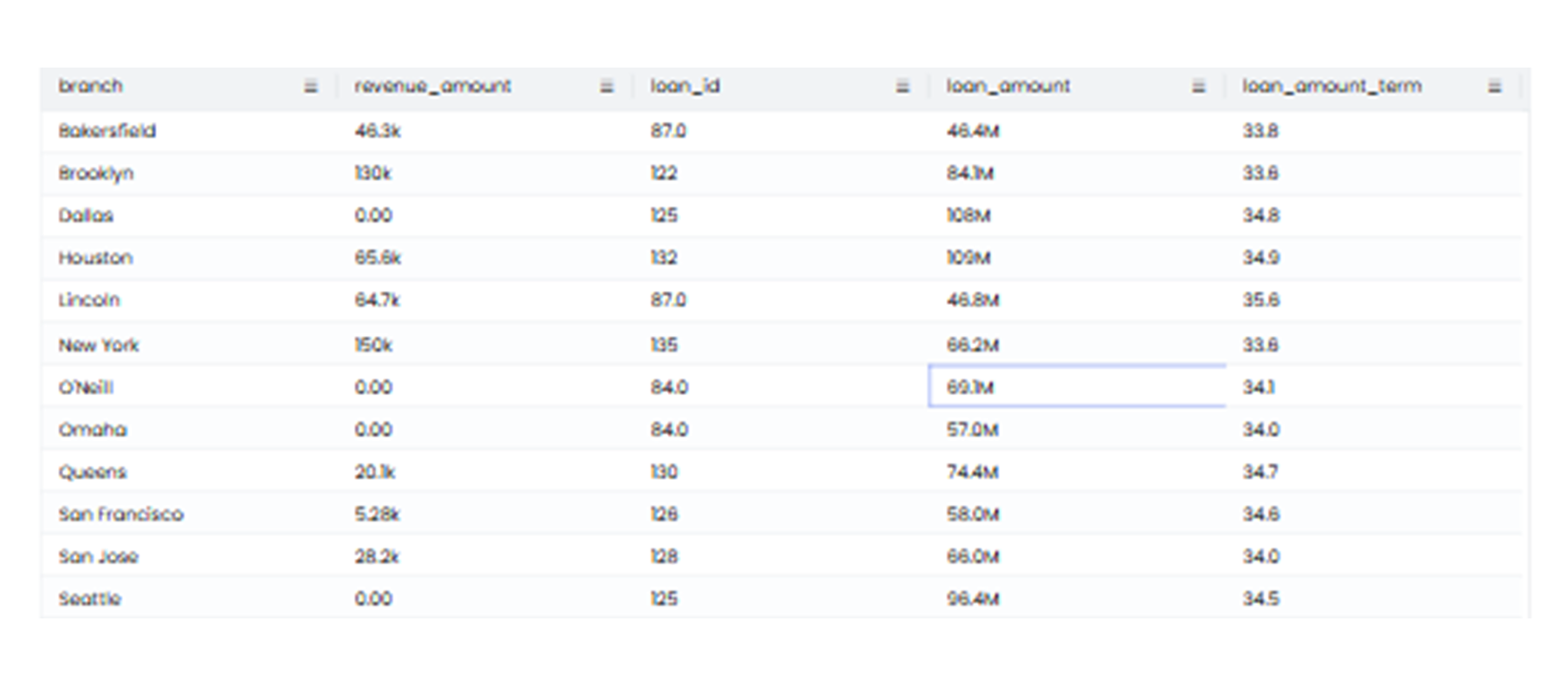
Each row represents a specific product category, while the columns display details such as sales figures, profit numbers, and individual feedback values. By organizing the data in this way, the table chart enables quick comparisons between rows and helps identify trends or patterns, such as the highest-performing products or areas needing improvement.
When to Use a Table Chart
-
Detailed Data Display: Use a table chart to present detailed numerical or textual data that requires precision.
-
Comparing Categories: A table chart allows users to compare multiple variables across different categories efficiently.
-
Data Organization: When data needs to be sorted, grouped, or filtered for specific insights.
-
Reference Data: Tables are ideal for data that must be used as a reference, as they present detailed information in a structured format.
Do’s:
-
Use a table chart when data needs to be displayed in a detailed and structured manner.
-
Label column headers and row headers clearly for easy understanding.
-
Highlight key data points using bold text, shading, or colors.
-
Keep the table organized by sorting the data logically, such as in ascending or descending order.
-
Use gridlines or borders to separate rows and columns for better readability.
Don’ts:
-
Don’t use a table chart for highly visual or aggregated data where charts or graphs would be more effective.
-
Don’t overload the table with too much information, as it can make the data difficult to load and interpret.
-
Don’t use inconsistent formatting; ensure uniformity across the table for clarity.