
Bar Chart and Column Chart (Grouped and Stacked)
A bar/column chart is the most common type of data visualization used to represent the data value with the rectangular bars. The length of the bar chart corresponds to the data value. The different lengths for each dimension value makes it easy to compare different dimensions labels.
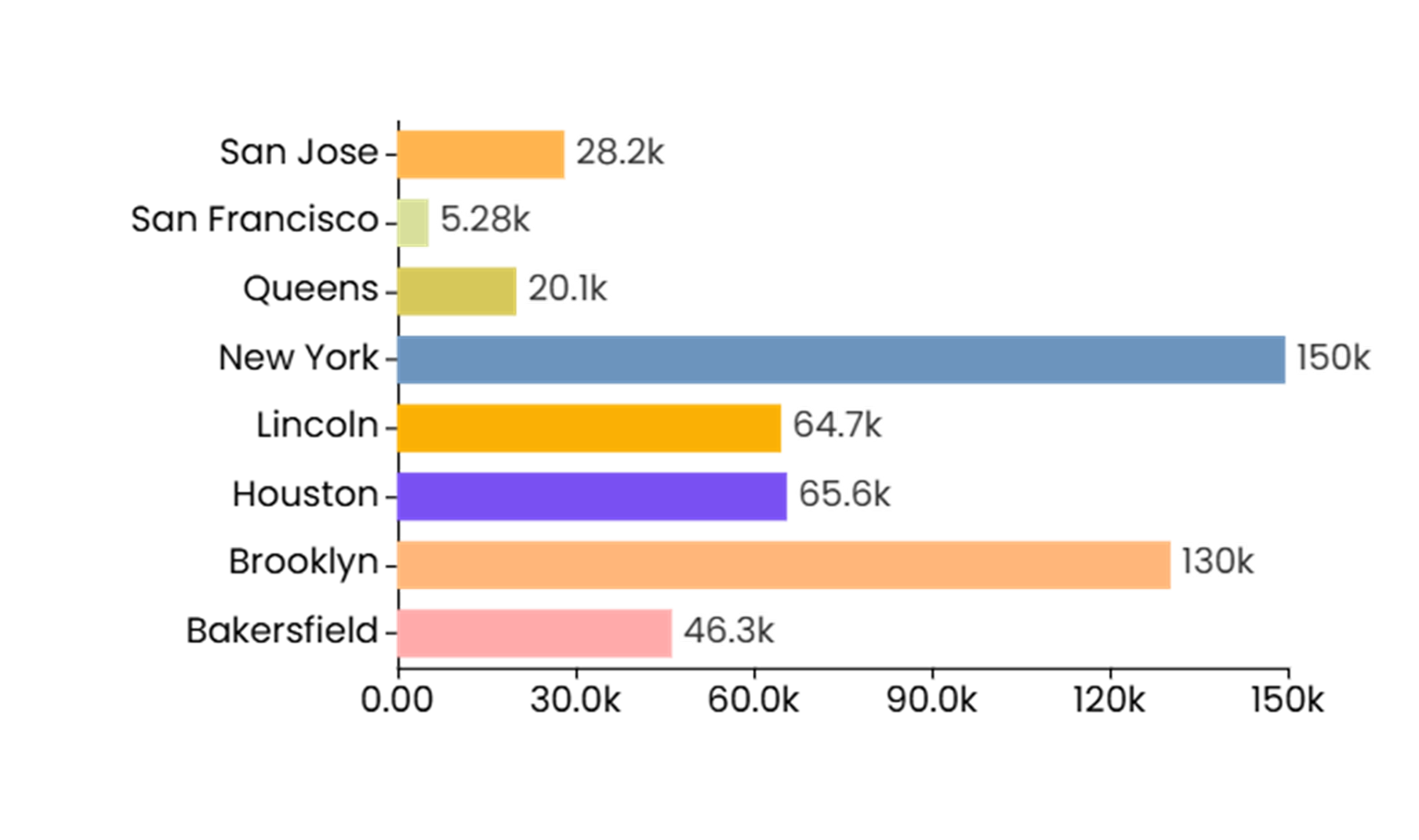
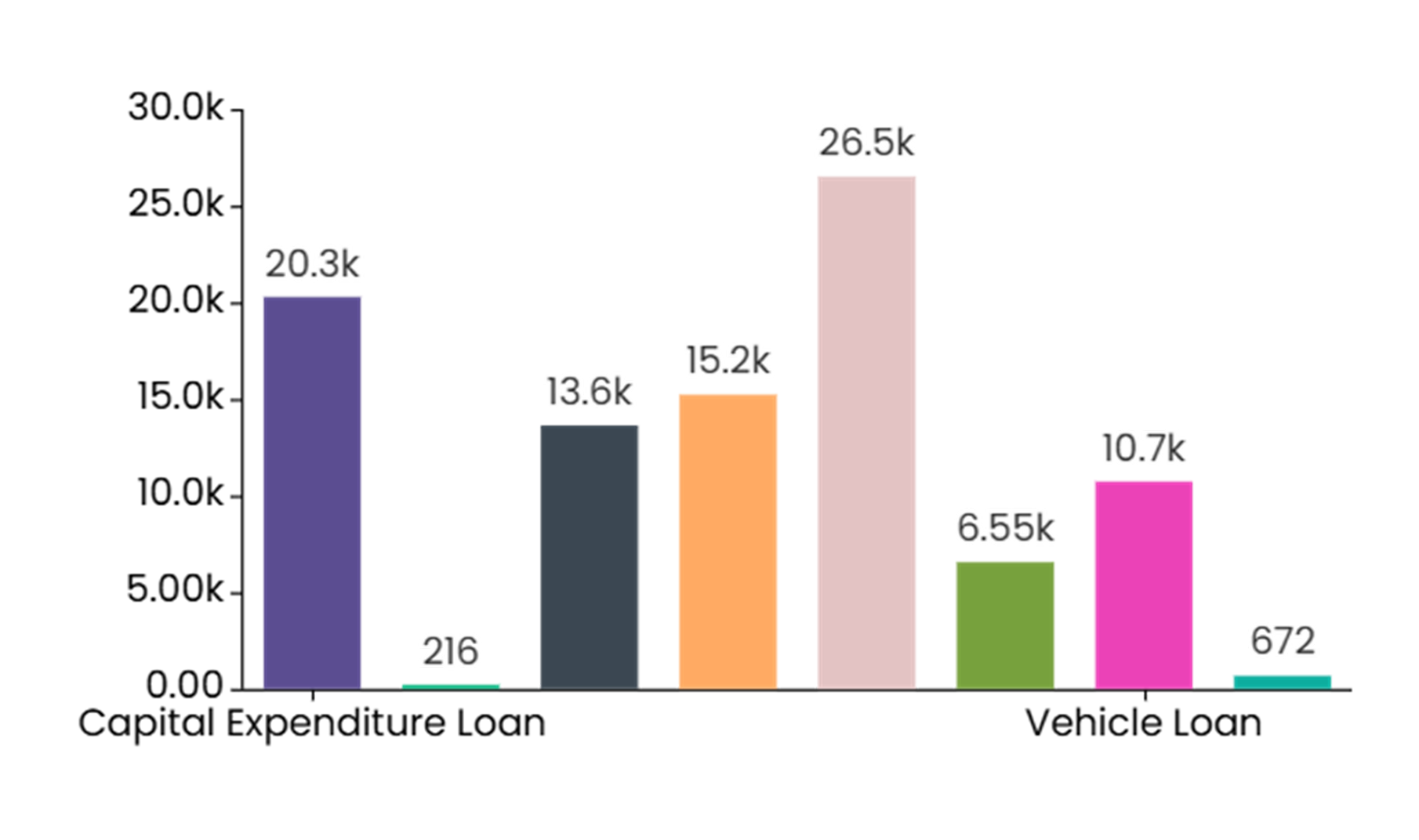
Bar/Column chart are an ideal option when you want to do the comparison of a measure value against dimension values or across different categories. The best example for when to use a bar/column chart is especially when you wish to compare the sales figures across different departments. Bar/Column chart can also be used when showcasing the trend over time over discrete data points like the quarterly price change. Additionally, bar/column charts can illustrate the part-to-whole relationships using stacked bars to show contributions of each category to a total and can also visualize frequency distributions. You can also use the bar/column charts to show case the stacked percentage contribution.
When to Use a Bar/Column Chart
A bar or column chart can be used to showcase comparisons between different categories or groups, showcase trends over time, part-to-whole relationships, and visualize frequency distributions. For example, a bar or column charts can easily showcase the comparison on sales figures across different product groups or countries.
Do’s:
-
Compare values between different categories or groups.
-
Use clear and concise labels for the x-axis (categories or groups) and y-axis (values) to ensure the chart is easy to understand.
-
Use different colors or patterns to differentiate between bars or columns, when comparing multiple categories or groups.
-
Use when you have categorical data (data that can be divided into distinct categories).
-
Use when you want to compare values between different categories or groups.
-
Use when you have discrete data points (e.g., months, product categories).
Don’ts:
-
Don’t use a bar or column chart for continuous data (use a line chart instead).
-
Don’t overcrowd the chart with too many bars or columns.