
Pie, Rose and Donut Chart
Pie/Rose/Donut charts are circular graphs that show percentages or proportions of a whole. It is simple to see the relative proportions of the various categories since each slice of the pie represents a portion of the whole.
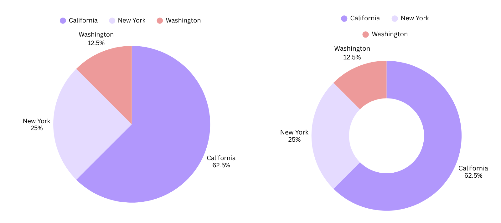
The donut and rose charts above illustrate the relative proportion of sales profit contributed by each product in the market. The rose chart helps you identify the contribution by the proportion size. The pie chart showcases the percentage contribution of each product in the market to the total sales profit.
When to Use a Pie/Rose/Donut Chart
-
Showing Proportions: Pie/Rose/Donut charts are most commonly used to show the relative proportions or percentages of different categories within a dataset. Each slice represents a relative proportions or percentage, making it easy to see which categories are larger or smaller.
-
Comparing Categories: While bar charts are typically used for comparing values between different categories, pie/rose/donut charts can also be used for rough comparisons. However, bar charts are generally more effective for precise comparisons.
-
Visualizing Percentages: Pie/Rose/Donut charts are ideal for visualizing percentages, as the size of each slice is proportional to the percentage it represents. This makes it easy to see the relative importance of each category.
Do’s:
-
Use clear and concise labels for each slice of the pie/rose/donut to ensure the chart is easy to understand.
-
Use different colors or patterns to differentiate between slices, especially when comparing multiple categories.
-
Use a legend or data labels to provide additional information about each category.
Don’ts:
-
Don’t use for large datasets or when the categories have similar proportions.
-
Don’t use when precise comparisons between categories are necessary, as bar charts are generally more effective for this purpose.
-
Don’t use to compare changes over time or to show trends.